


NEON GENESIS EVANGELION COMPANION APP
NEON GENESIS EVANGELION COMPANION APP
Project Overview
The Problem:
Traditional "wiki-style" fan applications are usually dense, visually cluttered, and completely unoptimized for responsive scaling across tablet and desktop interfaces. They lack immersive storytelling, making data consumption feel like reading a boring spreadsheet.
The Product:
An immersive mobile, tablet, and desktop fan ecosystem engineered to catalog, analyze, and track classified data from the Neon Genesis Evangelion franchise.
The Goal:
Build a responsive, high-fidelity digital platform that maintains an authentic, data-heavy NERV tactical terminal aesthetic while executing modern, fluid UX layout standards and pixel-perfect responsiveness.
My Role:
Lead UI/UX Designer & Interaction Designer.
Responsibilities:
User research, information architecture, desktop/tablet/mobile grid layout configuration, design system component creation, high-fidelity responsive prototyping, interaction engineering, and WCAG accessibility compliance testing.
Project Overview
The Problem:
Traditional "wiki-style" fan applications are usually dense, visually cluttered, and completely unoptimized for responsive scaling across tablet and desktop interfaces. They lack immersive storytelling, making data consumption feel like reading a boring spreadsheet.
The Goal:
Build a responsive, high-fidelity digital platform that maintains an authentic, data-heavy NERV tactical terminal aesthetic while executing modern, fluid UX layout standards and pixel-perfect responsiveness.
Responsibilities:
User research, information architecture, desktop/tablet/mobile grid layout configuration, design system component creation, high-fidelity responsive prototyping, interaction engineering, and WCAG accessibility compliance testing.
The Product:
An immersive mobile, tablet, and desktop fan ecosystem engineered to catalog, analyze, and track classified data from the Neon Genesis Evangelion franchise.
My Role:
Lead UI/UX Designer & Interaction Designer.
PROTOTYPES:
PROTOTYPES:
To understand how an audience would interact with a high-density, stylized data environment, I conducted targeted user research to map out the core needs of dedicated franchise fans and dashboard users. The goal was to identify how to present extensive catalog data without causing cognitive overload. By synthesizing this feedback into user personas and journey maps, I established a clear blueprint for the platform's information architecture and interaction flow.
Understanding The User
Persona & Problem Statement
Noah is a 22-year-old newcomer to the franchise who needs a highly structured, spoiler-guarded database to track complex characters and terminology because they are terrified of encountering major plot spoilers while trying to understand the show's lore.

User Journey Map
I mapped out Noah’s step-by-step experience to visualize how a newcomer interacts with franchise content from the moment they encounter a complex plot point to their final data search. Documenting this journey allowed me to identify critical touchpoints where a user might accidentally face major narrative spoilers. By identifying these emotional lows and frustration points early on, I was able to design proactive, spoiler-guarded navigation paths that keep the exploration experience safe, intuitive, and stress-free.


Sitemap
Before beginning any design work, I established a global sitemap to define how content would be organized and accessed across the NGE platform. This structural blueprint mapped out every major section and navigation path, ensuring a clear information hierarchy that would guide all subsequent design decisions and keep the user experience consistent and intentional from the ground up.
Persona & Problem Statement
User Journey Map
Sitemap
Before beginning any design work, I established a global sitemap to define how content would be organized and accessed across the NGE platform. This structural blueprint mapped out every major section and navigation path, ensuring a clear information hierarchy that would guide all subsequent design decisions and keep the user experience consistent and intentional from the ground up.
To understand how an audience would interact with a high-density, stylized data environment, I conducted targeted user research to map out the core needs of dedicated franchise fans and dashboard users. The goal was to identify how to present extensive catalog data without causing cognitive overload. By synthesizing this feedback into user personas and journey maps, I established a clear blueprint for the platform's information architecture and interaction flow.
Understanding The User
Noah is a 22-year-old newcomer to the franchise who needs a highly structured, spoiler-guarded database to track complex characters and terminology because they are terrified of encountering major plot spoilers while trying to understand the show's lore.
I mapped out Noah’s step-by-step experience to visualize how a newcomer interacts with franchise content from the moment they encounter a complex plot point to their final data search. Documenting this journey allowed me to identify critical touchpoints where a user might accidentally face major narrative spoilers. By identifying these emotional lows and frustration points early on, I was able to design proactive, spoiler-guarded navigation paths that keep the exploration experience safe, intuitive, and stress-free.
Starting The Design
Digital Wireframes
With the user research data and Noah's specific pain points mapped out, I translated the initial concept layouts into digital wireframes. The primary focus for the homepage wireframe was organizing structural placement, allocating horizontal grid density, and ensuring a clear informational hierarchy before introducing heavy visual styling.
By focusing strictly on content placement at this stage, I mapped out the global navigation paths and established localized data hubs to see how information flows naturally across the screen viewport.

"Alerts" Section: Synthesizes and surfaces upcoming events and high-priority notifications, anchoring the top of the hierarchy for immediate user awareness.
"Events" Section: Aggregates and displays upcoming in-person community events and regional conventions
Low-Fidelity Prototype
To test the early interface mechanics and validate the user flow, I connected the digital wireframes into a basic, low-fidelity interactive prototype. This step allowed me to simulate Noah’s actual user journey in real-time tracking how a user moves from the main navigation hub into the classified character registries.
By evaluating the layout dynamically at this stage, I was able to observe initial interactive touchpoints, check task completion efficiency, and catch layout spacing issues before moving into advanced component engineering.

Usability Study: Findings
Spoilers
Participants expressed significant anxiety regarding accidental exposure to plot twists and lore milestones while browsing data grids. Users across the study strongly requested an interactive "masking" mechanism or content toggle to conceal sensitive narrative data, ensuring they can explore character profiles safely without prematurely ruining their personal franchise experience.
Bookmarks
Due to the immense scale and complexity of the database registries, users struggled to retain and track specific files across multiple browsing sessions. The study highlighted a clear need for a personalized bookmarking or "save state" utility, allowing users to instantly archive high-priority data logs for efficient, secondary retrieval at a later time.
Events
Testing revealed that structural friction in the initial layout obscured physical community schedules. Users requested an entirely streamlined, location-based directory to eliminate navigation fatigue, allowing them to easily discover, filter, and track upcoming in-person conventions, venue details, and real-world fan deployments.
Starting The Design
Digital Wireframes
"Alerts" Section: Synthesizes and surfaces upcoming events and high-priority notifications, anchoring the top of the hierarchy for immediate user awareness.
"Events" Section: Aggregates and displays upcoming in-person community events and regional conventions
To test the early interface mechanics and validate the user flow, I connected the digital wireframes into a basic, low-fidelity interactive prototype. This step allowed me to simulate Noah’s actual user journey in real-time tracking how a user moves from the main navigation hub into the classified character registries.
By evaluating the layout dynamically at this stage, I was able to observe initial interactive touchpoints, check task completion efficiency, and catch layout spacing issues before moving into advanced component engineering.
Spoilers
Participants expressed significant anxiety regarding accidental exposure to plot twists and lore milestones while browsing data grids. Users across the study strongly requested an interactive "masking" mechanism or content toggle to conceal sensitive narrative data, ensuring they can explore character profiles safely without prematurely ruining their personal franchise experience.
Bookmarks
Due to the immense scale and complexity of the database registries, users struggled to retain and track specific files across multiple browsing sessions. The study highlighted a clear need for a personalized bookmarking or "save state" utility, allowing users to instantly archive high-priority data logs for efficient, secondary retrieval at a later time.
Events
Testing revealed that structural friction in the initial layout obscured physical community schedules. Users requested an entirely streamlined, location-based directory to eliminate navigation fatigue, allowing them to easily discover, filter, and track upcoming in-person conventions, venue details, and real-world fan deployments.
With the user research data and Noah's specific pain points mapped out, I translated the initial concept layouts into digital wireframes. The primary focus for the homepage wireframe was organizing structural placement, allocating horizontal grid density, and ensuring a clear informational hierarchy before introducing heavy visual styling.
By focusing strictly on content placement at this stage, I mapped out the global navigation paths and established localized data hubs to see how information flows naturally across the screen viewport.
Low-Fidelity Prototype
Usability Study: Findings
TRY THE LOW-FIDELITY PROTOTYPE
TRY THE LOW-FIDELITY PROTOTYPE
Mockups
Refining The Design
Before Usability Study

After Usability Study
Based on critical insights gathered from the usability study, I completely re-architected the Events interface to eliminate discovery friction. I shifted from a minimalist icon-based navigation setup to high-density, context-rich informational cards.
These new components surface high-priority event details directly at the surface level, reducing the user's cognitive load. Each responsive card acts as a clear, interactive touchpoint, allowing users to seamlessly click through to a dedicated, full-screen detail layout for comprehensive event schedules and venue information.
Before Usability Study


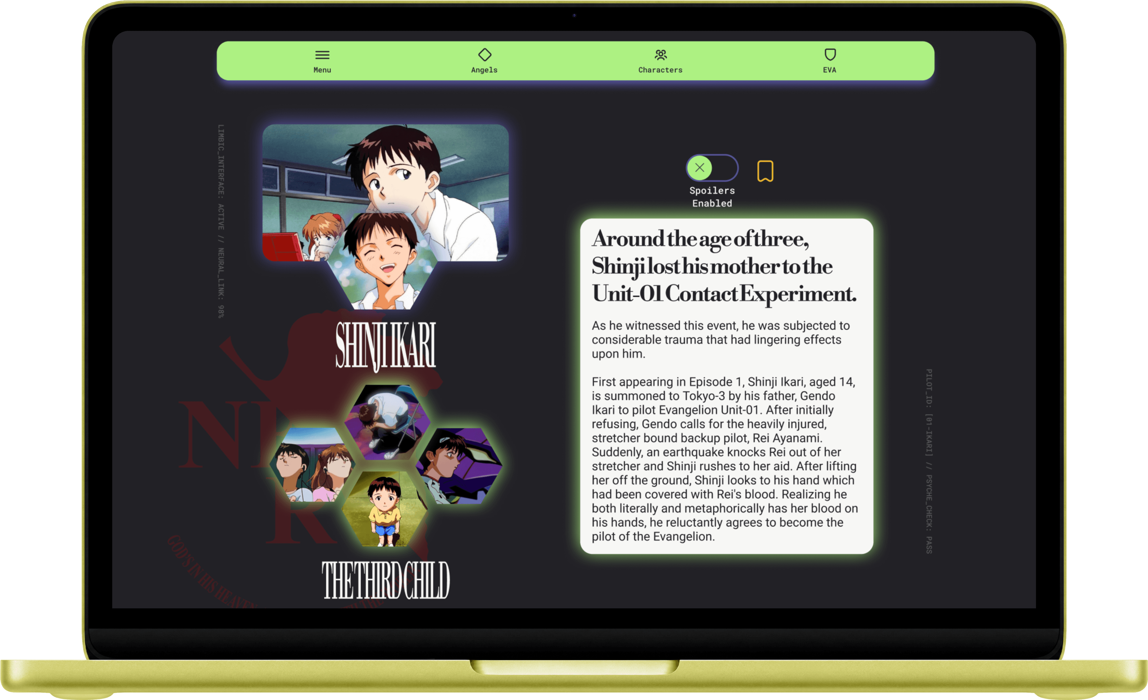
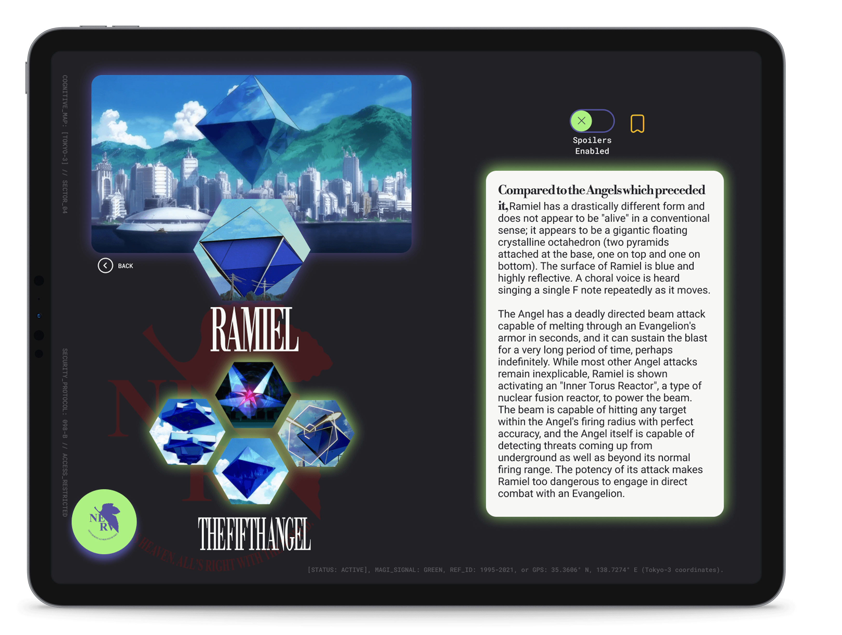
To directly solve our core persona's primary frustration points, the high-fidelity information registry screens introduce robust, user-controlled utility features.
First, I engineered intuitive Spoiler Controls that dynamically mask sensitive narrative timelines and character milestones, giving newcomers a completely safe space to explore lore without accidental plot exposure. Second, I integrated a streamlined Bookmarking System, establishing a frictionless path for users to instantly flag and archive complex tactical data for efficient, secondary retrieval during later browsing sessions.
Accessibility Considerations
Color Contrast Optimization (WCAG Compliance)
To ensure the dense tactical aesthetic did not compromise readability, I rigorously tested the interface's dark theme against WCAG contrast ratios. Every neon amber accent, glowing vector border, and deep slate background was calibrated to meet high-contrast accessibility standards, guaranteeing clear text legibility for users with low vision or color deficiencies.
Screen Reader Optimization & Descriptive Labeling
Because the application relies heavily on dynamic imagery, complex data grids, and interactive variants, I established a robust semantic layout structure. I audited the platform's labeling system to ensure that all navigation nodes, hidden utility buttons, and detailed imagery are fully optimized with intuitive descriptive alt-text for seamless screen reader compatibility.

High-Fidelity Prototype
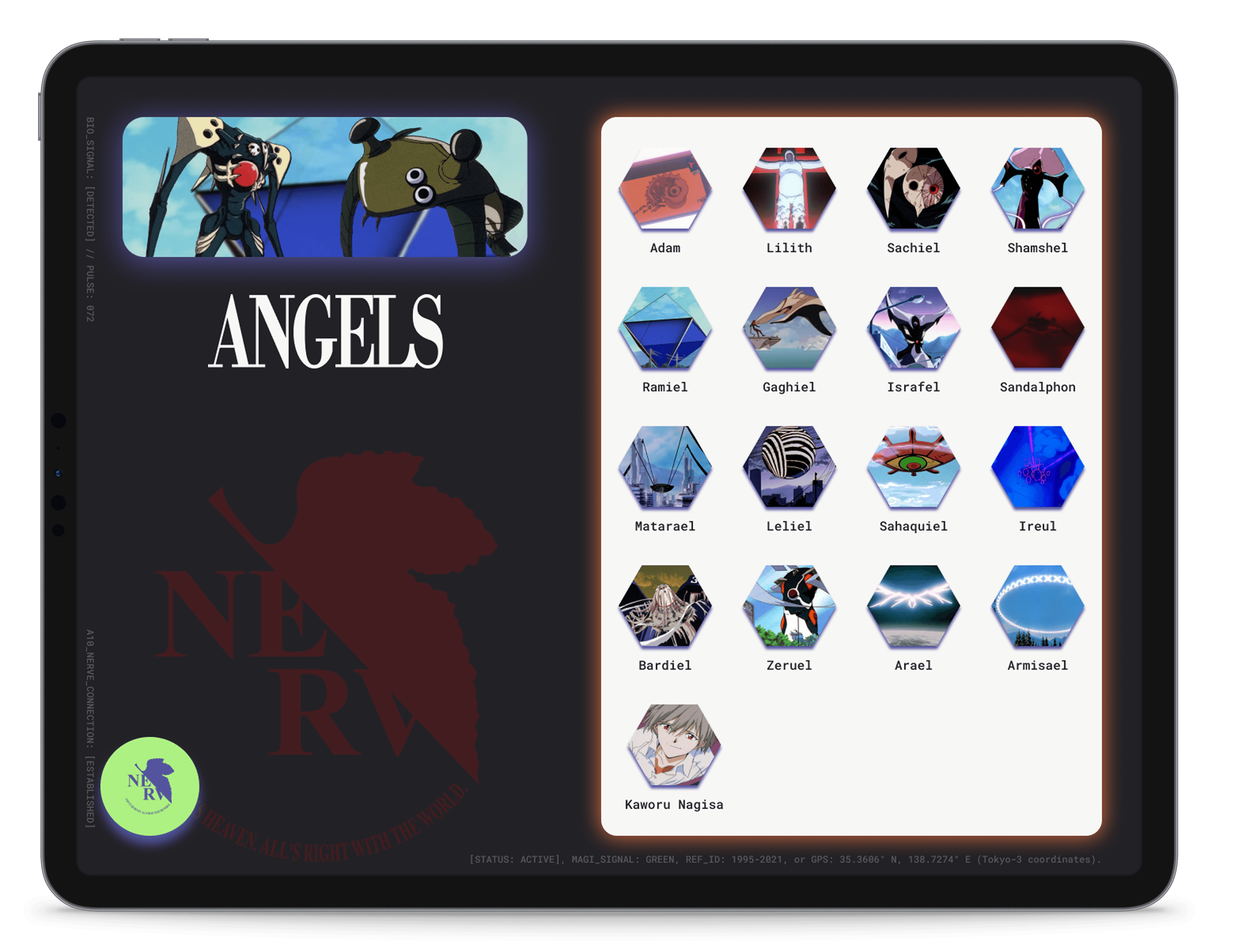
The high-fidelity prototype maintains structural continuity by following the exact user flow established during the low-fidelity phase. Additionally, it integrates all the strategic layout modifications and interface refinements that emerged from the initial usability study, resulting in a significantly more intuitive, user-validated experience.


After Usability Study





Responsive Design
To ensure a flawless multi-device experience, responsive layouts were developed for three distinct screen size variations: Mobile, Tablet, and Desktop. Every individual breakpoint was treated as a unique layout challenge, allowing me to optimize the informational architecture and interactive components to match the specific usability needs of each device scale.
Going Forward
Takeaways
Target Impact:
Post-study evaluations demonstrated high user satisfaction, with participants utilizing the platform as a dynamic live-viewing companion. By providing structured, granular details corresponding directly to on-screen events, the interface effectively bridged the gap between dense franchise lore and immediate user comprehension, vastly deepening overall engagement.
What I learned:
Mapping out a massive universe like NGE forces you to balance deep complexity with simple usability. I spent a lot of time trimming down text and building innovative filters so users wouldn't get hit with an immediate wall of text. The biggest victory was taking that distinct, heavy sci-fi aesthetic and successfully adapting it for both mobile and web viewports without losing the vibe or breaking the user experience.
Next Steps
Refine Mobile & Web Consistency:
Next, I'll launch detailed usability tests focused purely on the new responsive web layouts.
The goal is to make sure the scaling is smart and that the experience feels seamless no matter what device is used.
Expand Search & Filter Details:
I'd love to build out a deeper tagging system for the main search bar. Adding quick-filters like "Filter by Faction" or "Search by Episode Appearance" would give users a faster way to find exact lore pieces without having to dig through massive character registries.
Test Eye Strain & Viewing Comfort
Since this is a companion app meant to be used while watching a screen in a dark room, I want to run specific tests focused on eye strain. Checking how the high-contrast neon accents feel after an hour of viewing will help me fine-tune the brightness and background tones for long-term comfort.
After Usability Study
Before Usability Study
Based on critical insights gathered from the usability study, I completely re-architected the Events interface to eliminate discovery friction. I shifted from a minimalist icon-based navigation setup to high-density, context-rich informational cards.
These new components surface high-priority event details directly at the surface level, reducing the user's cognitive load. Each responsive card acts as a clear, interactive touchpoint, allowing users to seamlessly click through to a dedicated, full-screen detail layout for comprehensive event schedules and venue information.
Before Usability Study
After Usability Study
Mockups
Refining The Design
To directly solve our core persona's primary frustration points, the high-fidelity information registry screens introduce robust, user-controlled utility features.
First, I engineered intuitive Spoiler Controls that dynamically mask sensitive narrative timelines and character milestones, giving newcomers a completely safe space to explore lore without accidental plot exposure. Second, I integrated a streamlined Bookmarking System, establishing a frictionless path for users to instantly flag and archive complex tactical data for efficient, secondary retrieval during later browsing sessions.
Accessibility Considerations
Color Contrast Optimization (WCAG Compliance)
To ensure the dense tactical aesthetic did not compromise readability, I rigorously tested the interface's dark theme against WCAG contrast ratios. Every neon amber accent, glowing vector border, and deep slate background was calibrated to meet high-contrast accessibility standards, guaranteeing clear text legibility for users with low vision or color deficiencies.
Screen Reader Optimization & Descriptive Labeling
Because the application relies heavily on dynamic imagery, complex data grids, and interactive variants, I established a robust semantic layout structure. I audited the platform's labeling system to ensure that all navigation nodes, hidden utility buttons, and detailed imagery are fully optimized with intuitive descriptive alt-text for seamless screen reader compatibility.
High-Fidelity Prototype
The high-fidelity prototype maintains structural continuity by following the exact user flow established during the low-fidelity phase. Additionally, it integrates all the strategic layout modifications and interface refinements that emerged from the initial usability study, resulting in a significantly more intuitive, user-validated experience.
Responsive Design
To ensure a flawless multi-device experience, responsive layouts were developed for three distinct screen size variations: Mobile, Tablet, and Desktop. Every individual breakpoint was treated as a unique layout challenge, allowing me to optimize the informational architecture and interactive components to match the specific usability needs of each device scale.
Going Forward
Takeaways
Target Impact:
Post-study evaluations demonstrated high user satisfaction, with participants utilizing the platform as a dynamic live-viewing companion. By providing structured, granular details corresponding directly to on-screen events, the interface effectively bridged the gap between dense franchise lore and immediate user comprehension, vastly deepening overall engagement.
Next Steps
Refine Mobile & Web Consistency:
Next, I'll launch detailed usability tests focused purely on the new responsive web layouts.
The goal is to make sure the scaling is smart and that the experience feels seamless no matter what device is used.
Expand Search & Filter Details:
I'd love to build out a deeper tagging system for the main search bar. Adding quick-filters like "Filter by Faction" or "Search by Episode Appearance" would give users a faster way to find exact lore pieces without having to dig through massive character registries.
Test Eye Strain & Viewing Comfort
Since this is a companion app meant to be used while watching a screen in a dark room, I want to run specific tests focused on eye strain. Checking how the high-contrast neon accents feel after an hour of viewing will help me fine-tune the brightness and background tones for long-term comfort.
What I learned:
Mapping out a massive universe like NGE forces you to balance deep complexity with simple usability. I spent a lot of time trimming down text and building innovative filters so users wouldn't get hit with an immediate wall of text. The biggest victory was taking that distinct, heavy sci-fi aesthetic and successfully adapting it for both mobile and web viewports without losing the vibe or breaking the user experience.