


PROJECT OVERVIEW
THE PROBLEM:
H&M customers want a seamless and responsible way to clean out and revamp their wardrobe while being rewarded for it. The current state of garment resale is time consuming with little to no reward, while places that recycle clothing offer little transparency on where garments actually end upH&M customers want a seamless and responsible way to clean out and revamp their wardrobe while being rewarded for it. The current state of garment resale is time consuming with little to no reward, while places that recycle clothing offer little transparency on where garments actually end up.
THE PRODUCT:
A new in-store service allowing customers to bring in old H&M garments and trade them in for store credit or cash, while recycling non-H&M garments and textiles in exchange for a discount coupon. Customers can save time by scanning their garments at home and building trade-in bags accessible via QR code. Each bag provides an estimated value before arriving in store, eliminating the frustration and uncertainty experienced at traditional resale stores.
THE GOAL:
Design a high-fidelity addition to the H&M app that seamlessly integrates with the existing brand experience while providing H&M customers with an intuitive, accessible, and rewarding way to participate in sustainable fashion.
RESPONSIBILITIES:
User research, information architecture, mobile grid layout configuration, design system integration within an existing brand framework, high-fidelity prototyping, interaction engineering, and WCAG accessibility compliance testing.
MY ROLE:
Lead UI/UX Designer & Interaction Designer.
PROTOTYPES:
UNDERSTANDING THE USER
To understand how H&M customers would interact with a trade-in and recycling service, I conducted targeted user research to map out the core needs of sustainability-conscious shoppers and frequent resellers. The goal was to identify how to design a rewarding and transparent experience that builds trust while reducing the friction found in traditional garment resale. By synthesizing this research into user personas and journey maps, I established a clear foundation for the feature's information architecture and interaction flow.
PERSONA & PROBLEM STATEMENT
Ulric Ulric is a 23-year-old menswear street style vlogger based in Los Angeles. His whole brand is built around looking fresh, but he's not about to let his old pieces pile up or end up in a landfill. He's tried the resale store route before and walked out with $5 and a bruised ego, so he needs something that actually rewards him for doing the right thing. Ulric wants H&M reNEW to be his closet's revolving door. Trade in the old, earn credit for the new, and keep his wardrobe (and the planet) in rotation.

USER JOURNEY MAP
I mapped out Ulric's step-by-step experience to visualize how a frequent reseller interacts with a trade-in service from the moment he decides to clean out his closet to his final drop-off in store. Documenting this journey allowed me to identify critical touchpoints where frustration and uncertainty are most likely to occur. By identifying these emotional lows early on, I was able to design proactive solutions including at-home garment scanning and estimated trade-in values that reduce friction, set clear expectations, and turn a historically unrewarding experience into a seamless and satisfying one.

Before starting any design work, I mapped out where reNEW would live within the existing H&M app architecture. Rather than rebuilding the entire site map, I anchored reNEW as a new section within H&M's existing navigation alongside Women, Men, Kids, Home, and Beauty. From there I charted the core reNEW flow covering the onboarding pop up, the bag creation and management screen, the garment scanner, and the bag details screen. This structural blueprint ensured that reNEW felt like a natural extension of the H&M ecosystem rather than a disconnected feature, and served as the foundation for all subsequent design and navigation decisions.

SITEMAP
STARTING THE DESIGN
With the user research data and Ulric's specific pain points mapped out, I translated the initial concept sketches into digital wireframes. The primary focus was organizing the structural placement of the reNEW section within the existing H&M app framework, ensuring a clear informational hierarchy before introducing visual styling. By focusing strictly on content placement at this stage, I mapped out the core navigation paths and established how key interactions like garment scanning, bag creation, and trade-in estimates flow naturally across the user journey.
DIGITAL WIREFRAMES

LOW-FIDELITY PROTOTYPE
To test the early interface mechanics and validate the user flow, I connected the digital wireframes into a basic low-fidelity interactive prototype. This step allowed me to simulate Ulric's actual user journey in real time, tracking how a user moves from the H&M home screen into the reNEW section and through the full garment trade-in flow. By evaluating the layout dynamically at this stage, I was able to observe initial interactive touchpoints, check task completion efficiency, and catch layout and spacing issues before moving into high-fidelity design.

USABILITY STUDY: FINDINGS
1. TRANSPARANCY
During prototype evaluation, it became clear that users needed explicit confirmation that their garments were being handled responsibly. Without visible feedback on garment status and estimated values upfront, the trade-in flow felt uncertain and untrustworthy.
2. Manual Entry Fallback
Testing revealed that relying solely on the garment scanner created a potential drop-off point for users whose items failed to scan. A manual garment tag entry option was identified as a critical accessibility and edge case solution, ensuring users could continue moving through the trade-in flow without friction or frustration regardless of scan success.
3. Reward Clarity
Prototype evaluation highlighted that users needed immediate visibility into their estimated store credit and cash values before committing to the drop-off. Surfacing this information prominently and early in the flow was essential to building user confidence, setting clear expectations, and motivating task completion in a way that traditional resale stores consistently fail to do.
REFINING THE DESIGN
MOCKUPS




BEFORE USABILITY STUDY
AFTER USABILITY STUDY
BEFORE USABILITY STUDY
AFTER USABILITY STUDY
BEFORE USABILITY STUDY
AFTER USABILITY STUDY
Edge Case: Image Unavailable State
Based on insights gathered during prototype evaluation, I redesigned the onboarding experience to immediately communicate the value of reNEW upon first entry. The wireframe established the basic modal structure and content hierarchy, while the high-fidelity iteration introduced the full H&M visual language including the dimmed hero image backdrop, brand typography, and the Don't Show Again toggle to respect returning users. The Learn more about environmental impact link was also added at this stage to directly address the transparency concern identified during usability findings, ensuring users feel informed and confident before engaging with the trade-in flow.
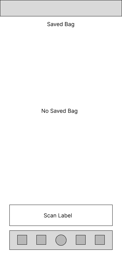
The empty state screen underwent a significant visual transformation from wireframe to high-fidelity. While the wireframe established the core layout and primary CTA placement, the high-fidelity design introduced H&M's dark mode aesthetic, bold condensed typography, and a renamed call to action from "Scan Label" to "Scan Garment Tag" for clearer language and accessibility. The empty state messaging was also refined to ensure users immediately understand the next step without confusion.
The Saved Bag screen represents the most significant evolution from wireframe to high-fidelity. The wireframe established the core list layout, item hierarchy, and estimated value placement at the bottom of the screen, while the high-fidelity design introduced H&M's dark aesthetic, product photography, bold condensed typography, and clearly labeled estimated in-store credit and cash values for each individual item. A QR code was surfaced prominently above the total estimates to ensure users can access their drop-off code without any additional steps. To account for instances where a product image is unavailable, a branded H&M logo placeholder was implemented as a fallback state, maintaining visual consistency throughout the list without breaking the layout or creating a disruptive error state for the user.
ACCESSIBILITY CONSIDERATIONS
Plain Language & Readability
Sustainability and trade-in processes can feel complex and overwhelming to new users. To ensure reNEW is accessible to users of all literacy levels, I prioritized plain conversational language throughout the interface, avoiding jargon and keeping instructional copy concise and action oriented. This is especially evident in the onboarding popup and empty state messaging.
Error Prevention & Edge Case Design
Recognizing that not all garment barcodes will scan successfully, I designed a manual garment tag entry fallback to prevent users from reaching a dead end in the flow. This proactive error prevention approach ensures that all users can complete the trade-in process regardless of barcode condition or scanning environment, reducing frustration and task abandonment.
HIGH-FIDELITY PROTOTYPE
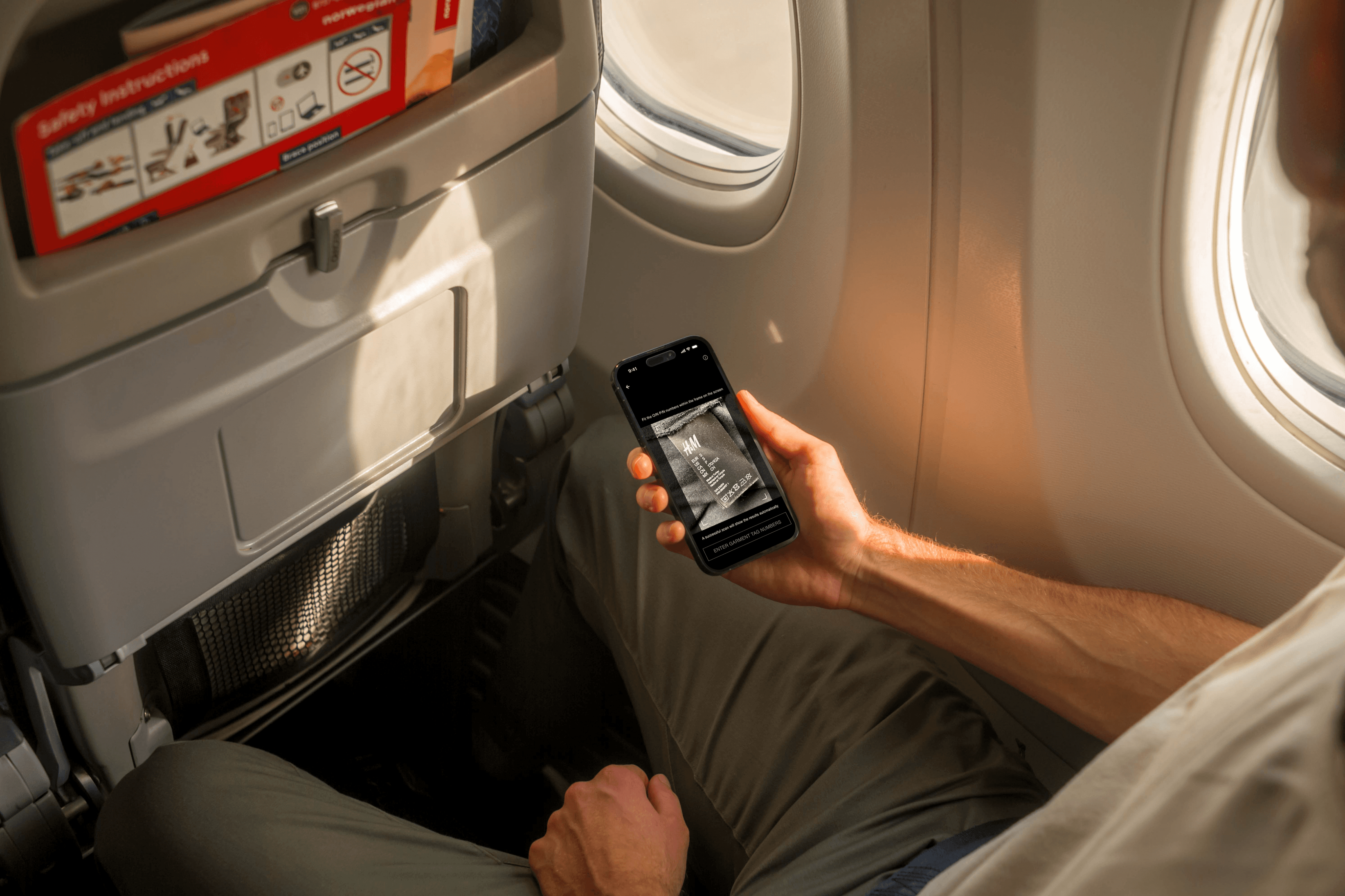
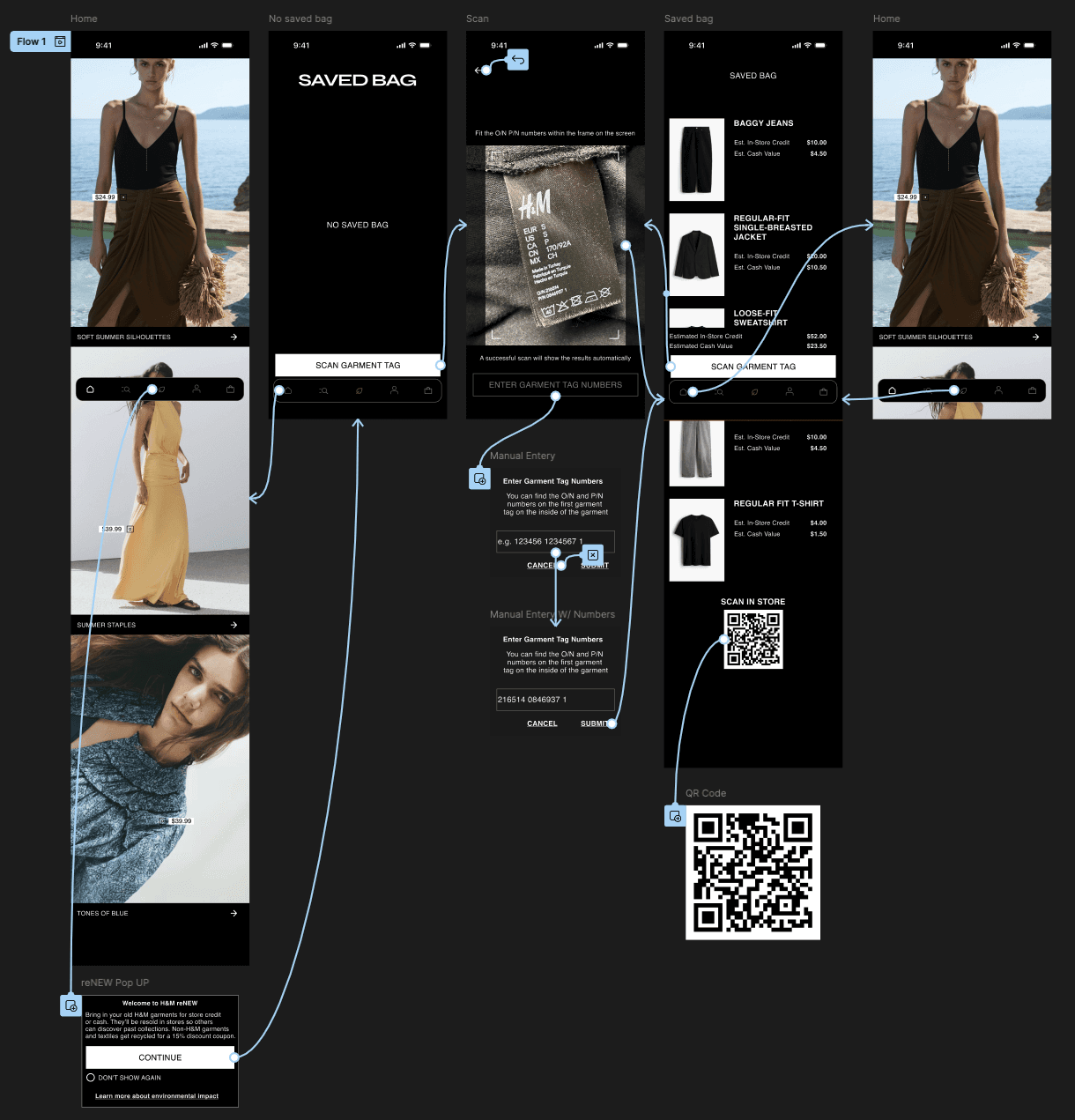
The high-fidelity prototype maintains structural continuity by following the exact user flow established during the low-fidelity phase. Additionally, it integrates all the layout refinements and interface improvements that emerged from prototype evaluation, including clearer reward transparency, a manual entry fallback for edge cases, and H&M brand consistency throughout every screen, resulting in a more intuitive and confidence inspiring experience for users engaging with reNEW for the first time.


GOING FORWARD
TAKE AWAYS
WHAT I LEARNED
Designing within an existing brand ecosystem is a fundamentally different challenge than building from scratch. Every decision had to feel like it belonged in the H&M app while still introducing something genuinely new. The biggest win was learning to use constraints as a creative tool. Leaning into H&M's existing patterns for the cart, scanner, and navigation meant I could focus my energy on the moments that actually needed new thinking, like the onboarding popup, the bag creation flow, and the reward transparency experience.
NEXT STEPS
EXPANDED ACCESSIBILITY AUDIT
Conduct a full WCAG 2.1 AA audit on the completed high-fidelity prototype with assistive technology users to validate screen reader compatibility and touch target sizing across devices.
GARMENT CONDITION GRADING
Introduce a condition rating step during the scanning flow so users receive more accurate estimates based on wear level, reducing surprise and disappointment at the point of drop-off.
PUSH NOTIFICATION SYSTEM
Design a notification flow that reminds users about saved bags, upcoming reNEW events, or when their store credit is about to expire to drive return visits and task completion.
TARGET IMPACT
Designing reNEW reinforced that a seamless reward experience is the key to driving sustainable behavior at scale. By surfacing estimated trade-in values before the user ever steps foot in store, the interface directly addresses the frustration and uncertainty that keeps customers away from traditional resale. The result is a feature that makes doing the right thing for the planet feel effortless and worth it.
RESPONSIBILITIES:
User research, information architecture, mobile grid layout configuration, design system integration within an existing brand framework, high-fidelity prototyping, interaction engineering, and WCAG accessibility compliance testing.
PROJECT OVERVIEW
THE PROBLEM:
H&M customers want a seamless and responsible way to clean out and revamp their wardrobe while being rewarded for it. The current state of garment resale is time consuming with little to no reward, while places that recycle clothing offer little transparency on where garments actually end upH&M customers want a seamless and responsible way to clean out and revamp their wardrobe while being rewarded for it. The current state of garment resale is time consuming with little to no reward, while places that recycle clothing offer little transparency on where garments actually end up.
MY ROLE:
Lead UI/UX Designer & Interaction Designer.
THE GOAL:
Design a high-fidelity addition to the H&M app that seamlessly integrates with the existing brand experience while providing H&M customers with an intuitive, accessible, and rewarding way to participate in sustainable fashion.
THE PRODUCT:
A new in-store service allowing customers to bring in old H&M garments and trade them in for store credit or cash, while recycling non-H&M garments and textiles in exchange for a discount coupon. Customers can save time by scanning their garments at home and building trade-in bags accessible via QR code. Each bag provides an estimated value before arriving in store, eliminating the frustration and uncertainty experienced at traditional resale stores.
PROTOTYPES:
PROTOTYPES:
UNDERSTANDING THE USER
To understand how H&M customers would interact with a trade-in and recycling service, I conducted targeted user research to map out the core needs of sustainability-conscious shoppers and frequent resellers. The goal was to identify how to design a rewarding and transparent experience that builds trust while reducing the friction found in traditional garment resale. By synthesizing this research into user personas and journey maps, I established a clear foundation for the feature's information architecture and interaction flow.
Ulric Ulric is a 23-year-old menswear street style vlogger based in Los Angeles. His whole brand is built around looking fresh, but he's not about to let his old pieces pile up or end up in a landfill. He's tried the resale store route before and walked out with $5 and a bruised ego, so he needs something that actually rewards him for doing the right thing. Ulric wants H&M reNEW to be his closet's revolving door. Trade in the old, earn credit for the new, and keep his wardrobe (and the planet) in rotation.
PERSONA & PROBLEM STATEMENT
SITEMAP
USER JOURNEY MAP
I mapped out Ulric's step-by-step experience to visualize how a frequent reseller interacts with a trade-in service from the moment he decides to clean out his closet to his final drop-off in store. Documenting this journey allowed me to identify critical touchpoints where frustration and uncertainty are most likely to occur. By identifying these emotional lows early on, I was able to design proactive solutions including at-home garment scanning and estimated trade-in values that reduce friction, set clear expectations, and turn a historically unrewarding experience into a seamless and satisfying one.
Before starting any design work, I mapped out where reNEW would live within the existing H&M app architecture. Rather than rebuilding the entire site map, I anchored reNEW as a new section within H&M's existing navigation alongside Women, Men, Kids, Home, and Beauty. From there I charted the core reNEW flow covering the onboarding pop up, the bag creation and management screen, the garment scanner, and the bag details screen. This structural blueprint ensured that reNEW felt like a natural extension of the H&M ecosystem rather than a disconnected feature, and served as the foundation for all subsequent design and navigation decisions.
3. Reward Clarity
Prototype evaluation highlighted that users needed immediate visibility into their estimated store credit and cash values before committing to the drop-off. Surfacing this information prominently and early in the flow was essential to building user confidence, setting clear expectations, and motivating task completion in a way that traditional resale stores consistently fail to do.
STARTING THE DESIGN
DIGITAL WIREFRAMES
With the user research data and Ulric's specific pain points mapped out, I translated the initial concept sketches into digital wireframes. The primary focus was organizing the structural placement of the reNEW section within the existing H&M app framework, ensuring a clear informational hierarchy before introducing visual styling. By focusing strictly on content placement at this stage, I mapped out the core navigation paths and established how key interactions like garment scanning, bag creation, and trade-in estimates flow naturally across the user journey.
LOW-FIDELITY PROTOTYPE
To test the early interface mechanics and validate the user flow, I connected the digital wireframes into a basic low-fidelity interactive prototype. This step allowed me to simulate Ulric's actual user journey in real time, tracking how a user moves from the H&M home screen into the reNEW section and through the full garment trade-in flow. By evaluating the layout dynamically at this stage, I was able to observe initial interactive touchpoints, check task completion efficiency, and catch layout and spacing issues before moving into high-fidelity design.
DIGITAL WIREFRAMES
1. TRANSPARANCY
During prototype evaluation, it became clear that users needed explicit confirmation that their garments were being handled responsibly. Without visible feedback on garment status and estimated values upfront, the trade-in flow felt uncertain and untrustworthy.
2. Manual Entry Fallback
Testing revealed that relying solely on the garment scanner created a potential drop-off point for users whose items failed to scan. A manual garment tag entry option was identified as a critical accessibility and edge case solution, ensuring users could continue moving through the trade-in flow without friction or frustration regardless of scan success.
MOCKUPS
REFINING THE DESIGN
BEFORE USABILITY STUDY
AFTER USABILITY STUDY
Based on insights gathered during prototype evaluation, I redesigned the onboarding experience to immediately communicate the value of reNEW upon first entry. The wireframe established the basic modal structure and content hierarchy, while the high-fidelity iteration introduced the full H&M visual language including the dimmed hero image backdrop, brand typography, and the Don't Show Again toggle to respect returning users. The Learn more about environmental impact link was also added at this stage to directly address the transparency concern identified during usability findings, ensuring users feel informed and confident before engaging with the trade-in flow.
BEFORE USABILITY STUDY
AFTER USABILITY STUDY
The empty state screen underwent a significant visual transformation from wireframe to high-fidelity. While the wireframe established the core layout and primary CTA placement, the high-fidelity design introduced H&M's dark mode aesthetic, bold condensed typography, and a renamed call to action from "Scan Label" to "Scan Garment Tag" for clearer language and accessibility. The empty state messaging was also refined to ensure users immediately understand the next step without confusion.
BEFORE USABILITY STUDY
AFTER USABILITY STUDY
Edge Case: Image Unavailable State
The Saved Bag screen represents the most significant evolution from wireframe to high-fidelity. The wireframe established the core list layout, item hierarchy, and estimated value placement at the bottom of the screen, while the high-fidelity design introduced H&M's dark aesthetic, product photography, bold condensed typography, and clearly labeled estimated in-store credit and cash values for each individual item. A QR code was surfaced prominently above the total estimates to ensure users can access their drop-off code without any additional steps. To account for instances where a product image is unavailable, a branded H&M logo placeholder was implemented as a fallback state, maintaining visual consistency throughout the list without breaking the layout or creating a disruptive error state for the user.
ACCESSIBILITY CONSIDERATIONS
Plain Language & Readability
Sustainability and trade-in processes can feel complex and overwhelming to new users. To ensure reNEW is accessible to users of all literacy levels, I prioritized plain conversational language throughout the interface, avoiding jargon and keeping instructional copy concise and action oriented. This is especially evident in the onboarding popup and empty state messaging.
HIGH-FIDELITY PROTOTYPE
The high-fidelity prototype maintains structural continuity by following the exact user flow established during the low-fidelity phase. Additionally, it integrates all the layout refinements and interface improvements that emerged from prototype evaluation, including clearer reward transparency, a manual entry fallback for edge cases, and H&M brand consistency throughout every screen, resulting in a more intuitive and confidence inspiring experience for users engaging with reNEW for the first time.
Error Prevention & Edge Case Design
Recognizing that not all garment barcodes will scan successfully, I designed a manual garment tag entry fallback to prevent users from reaching a dead end in the flow. This proactive error prevention approach ensures that all users can complete the trade-in process regardless of barcode condition or scanning environment, reducing frustration and task abandonment.
GOING FORWARD
TAKE AWAYS
TARGET IMPACT
Designing reNEW reinforced that a seamless reward experience is the key to driving sustainable behavior at scale. By surfacing estimated trade-in values before the user ever steps foot in store, the interface directly addresses the frustration and uncertainty that keeps customers away from traditional resale. The result is a feature that makes doing the right thing for the planet feel effortless and worth it.
NEXT STEPS
EXPANDED ACCESSIBILITY AUDIT
Conduct a full WCAG 2.1 AA audit on the completed high-fidelity prototype with assistive technology users to validate screen reader compatibility and touch target sizing across devices.
PUSH NOTIFICATION SYSTEM
Design a notification flow that reminds users about saved bags, upcoming reNEW events, or when their store credit is about to expire to drive return visits and task completion.
GARMENT CONDITION GRADING
Introduce a condition rating step during the scanning flow so users receive more accurate estimates based on wear level, reducing surprise and disappointment at the point of drop-off.
WHAT I LEARNED
Designing within an existing brand ecosystem is a fundamentally different challenge than building from scratch. Every decision had to feel like it belonged in the H&M app while still introducing something genuinely new. The biggest win was learning to use constraints as a creative tool. Leaning into H&M's existing patterns for the cart, scanner, and navigation meant I could focus my energy on the moments that actually needed new thinking, like the onboarding popup, the bag creation flow, and the reward transparency experience.