Carve
Carve


Project Overview
Project Overview
The Problem:
Carve began as a personal project built at the age of 21 out of a deep love for longboarding and the culture surrounding it. Originally designed in Adobe Illustrator during a Graphic Design course, long before I had any formal UX education, the app was built on passion alone. Years later, armed with professional experience and a user-centered design foundation, I returned to Carve with fresh eyes. Not just to redesign it, but to rebuild it with intention. This case study documents that transformation.
The Product:
A mobile application designed to bring the longboarding community closer together and make skating more accessible. Carve gives users the tools to discover and share skate locations, plan and attend community events, and document their rides and adventures. Through geolocation services, riders can effortlessly explore new areas around them or contribute spots they love to a growing community-maintained map.
The Goal:
Redesign a concept app from the ground up, implementing geolocation-based features and social functionality that empower users to connect with other longboarders, discover and share skate spots, and build a thriving community around a shared passion.
My Role:
Lead UX/UI Designer and Interaction Designer.
Responsibilities:
User research, information architecture, mobile grid layout, design system development, high-fidelity prototyping, interaction design, and WCAG accessibility compliance.
Prototypes
The Product:
A mobile application designed to bring the longboarding community closer together and make skating more accessible. Carve gives users the tools to discover and share skate locations, plan and attend community events, and document their rides and adventures. Through geolocation services, riders can effortlessly explore new areas around them or contribute spots they love to a growing community-maintained map.
The Problem:
Carve began as a personal project built at the age of 21 out of a deep love for longboarding and the culture surrounding it. Originally designed in Adobe Illustrator during a Graphic Design course, long before I had any formal UX education, the app was built on passion alone. Years later, armed with professional experience and a user-centered design foundation, I returned to Carve with fresh eyes. Not just to redesign it, but to rebuild it with intention. This case study documents that transformation.
My Role:
Lead UX/UI Designer and Interaction Designer.
Responsibilities:
User research, information architecture, mobile grid layout, design system development, high-fidelity prototyping, interaction design, and WCAG accessibility compliance.
Understanding The User
Understanding
The User
To understand how Carve users would interact with a socially-driven longboarding app, I conducted competitive analysis and developed user personas based on community insights to identify the core needs that existing fitness and lifestyle apps were failing to address. By synthesizing this research into a user persona and journey map, I established a clear foundation for the app's information architecture and interaction flow
Persona and Problem Statment
Ryder has been longboarding since high school, using it as her primary way to decompress after long shifts at the coffee shop. She knows LA has incredible skating terrain but finding it has always been the challenge. She relies on Instagram posts and word of mouth from strangers at the park. After downloading three different apps in search of a solution, none of them were built with a longboarder in mind. Ryder wants one dedicated space where she can save spots, see what other riders are hitting, and feel like part of a scene rather than navigating it alone.

User Journey Map
User Journey Map
I mapped Ryder's step-by-step experience to visualize how a potential user who is new to an area would go about discovering a place to skate. Documenting this journey allowed me to identify critical touchpoints where uncertainty and friction were most likely to occur. By surfacing these emotional lows early in the process, I was able to design engaging experiences that encourage users to return to the app frequently, connect with others, and actively contribute to the community.

Sitemap
Sitemap
Before beginning any design work, I established a comprehensive site map to define how content would be organized and accessed throughout Carve. This structural blueprint allowed me to map every major section and navigation path, ensuring a clear information hierarchy that would guide all subsequent design decisions. Building the site map also served as an opportunity to critically evaluate the original app's feature set, determining what to carry forward, what to remove, and what new functionality was needed to meet the standards of modern fitness and community-driven applications.

Persona and Problem Statment
Ryder has been longboarding since high school, using it as her primary way to decompress after long shifts at the coffee shop. She knows LA has incredible skating terrain but finding it has always been the challenge. She relies on Instagram posts and word of mouth from strangers at the park. After downloading three different apps in search of a solution, none of them were built with a longboarder in mind. Ryder wants one dedicated space where she can save spots, see what other riders are hitting, and feel like part of a scene rather than navigating it alone.
I mapped Ryder's step-by-step experience to visualize how a potential user who is new to an area would go about discovering a place to skate. Documenting this journey allowed me to identify critical touchpoints where uncertainty and friction were most likely to occur. By surfacing these emotional lows early in the process, I was able to design engaging experiences that encourage users to return to the app frequently, connect with others, and actively contribute to the community.
Before beginning any design work, I established a comprehensive site map to define how content would be organized and accessed throughout Carve. This structural blueprint allowed me to map every major section and navigation path, ensuring a clear information hierarchy that would guide all subsequent design decisions. Building the site map also served as an opportunity to critically evaluate the original app's feature set, determining what to carry forward, what to remove, and what new functionality was needed to meet the standards of modern fitness and community-driven applications.
To understand how Carve users would interact with a socially-driven longboarding app, I conducted competitive analysis and developed user personas based on community insights to identify the core needs that existing fitness and lifestyle apps were failing to address. By synthesizing this research into a user persona and journey map, I established a clear foundation for the app's information architecture and interaction flow
Starting The Design
Starting The Design
Digital Wireframes
Digital Wireframes
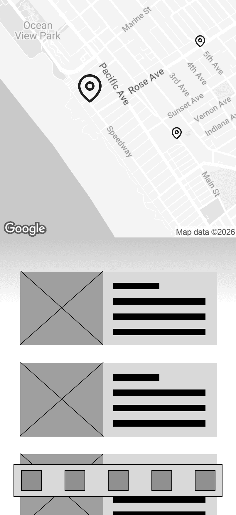
With the user research data and Ryder's specific pain points mapped out, I translated the redesigned concept layouts into digital wireframes. Unlike my previous projects, Carve presented a unique challenge, rather than designing from scratch or layering onto an existing product, I was critically reimagining an app I had originally built myself. This required setting aside personal attachment to earlier design decisions and approaching the structure with fresh, user-centered thinking.
The primary focus at this stage was establishing a clear informational hierarchy across the app's four core pillars: Spots, Community, Events, and Profile, while ensuring each section served a distinct user need without overlap. By focusing strictly on content placement and navigation flow, I mapped out how a user like Ryder would move from discovering a nearby spot to starting a session. This persona-driven approach shaped every layout decision before any visual styling was introduced.

Low-Fidelity Prototype
To test early interface mechanics and validate the user flow, I connected the digital wireframes into a basic low-fidelity interactive prototype. This step allowed me to simulate Ryder's actual user journey in real time, tracking how a user navigates from the home screen into the Spots section to find a location and begin a ride. By evaluating the layout dynamically at this stage, I was able to observe initial interactive touchpoints, assess task completion efficiency, and identify layout and spacing issues before moving into high-fidelity component development.

Usability Study Findings
Spot Discovery Confusion
During usability testing, participants were initially unsure whether tapping a spot card on the home screen would navigate to spot details or directly launch a session. Users expected a clearer distinction between exploring a spot and committing to a ride. This feedback led to the addition of an explicit "Start Ride" button on the spot detail page, removing ambiguity from the interaction entirely.
Community Board Engagement
Participants expressed uncertainty about whether Community Board content was local or global. Several users wanted confirmation that posts were coming from riders in their area rather than anywhere in the app. This informed the decision to display location context on community posts and surface nearby content at the top of the feed by default.
Session Tracking Visibility
Users who navigated away from an active session to browse other sections of the app felt anxious that their session had ended or was no longer tracking. This directly validated the persistent "Back to Ride" pill positioned above the navigation bar, confirming it as an essential feature rather than a supplementary one.
Low-Fidelity Prototype
To test early interface mechanics and validate the user flow, I connected the digital wireframes into a basic low-fidelity interactive prototype. This step allowed me to simulate Ryder's actual user journey in real time, tracking how a user navigates from the home screen into the Spots section to find a location and begin a ride. By evaluating the layout dynamically at this stage, I was able to observe initial interactive touchpoints, assess task completion efficiency, and identify layout and spacing issues before moving into high-fidelity component development.
Usability Study Findings
Spot Discovery Confusion
During usability testing, participants were initially unsure whether tapping a spot card on the home screen would navigate to spot details or directly launch a session. Users expected a clearer distinction between exploring a spot and committing to a ride. This feedback led to the addition of an explicit "Start Ride" button on the spot detail page, removing ambiguity from the interaction entirely.
Community Board Engagement
Participants expressed uncertainty about whether Community Board content was local or global. Several users wanted confirmation that posts were coming from riders in their area rather than anywhere in the app. This informed the decision to display location context on community posts and surface nearby content at the top of the feed by default.
Session Tracking Visibility
Users who navigated away from an active session to browse other sections of the app felt anxious that their session had ended or was no longer tracking. This directly validated the persistent "Back to Ride" pill positioned above the navigation bar, confirming it as an essential feature rather than a supplementary one.
With the user research data and Ryder's specific pain points mapped out, I translated the redesigned concept layouts into digital wireframes. Unlike my previous projects, Carve presented a unique challenge, rather than designing from scratch or layering onto an existing product, I was critically reimagining an app I had originally built myself. This required setting aside personal attachment to earlier design decisions and approaching the structure with fresh, user-centered thinking.
The primary focus at this stage was establishing a clear informational hierarchy across the app's four core pillars: Spots, Community, Events, and Profile, while ensuring each section served a distinct user need without overlap. By focusing strictly on content placement and navigation flow, I mapped out how a user like Ryder would move from discovering a nearby spot to starting a session. This persona-driven approach shaped every layout decision before any visual styling was introduced.
Refining The Design
Refining The Design
Mockups
Mockups
Accessibility Considerations
Color Contrast and Legibility
The Carve color palette was evaluated for WCAG compliance throughout the design process. Coffee Bean was selected as the primary text color against the Ivory background to maintain sufficient contrast ratios for users with low vision or color sensitivity. Sandy Brown was intentionally reserved for CTAs and interactive highlights rather than body text to avoid contrast issues at smaller type sizes.
Touch Target Sizing
All interactive elements including navigation bar icons, spot cards, and action buttons were designed with a minimum touch target size of 44x44px in accordance with Apple's Human Interface Guidelines. This ensures the app remains comfortably usable for individuals with motor impairments or larger hands, reducing accidental input and improving overall navigation accuracy.
High-Fidelity Prototype
With the wireframes validated and the visual design system fully established, I brought Carve to life as a high-fidelity interactive prototype in Figma. The prototype captures the primary user flow, Ryder's spot discovery journey through the app, allowing for a realistic representation of Carve's core interactions. Key moments including the persistent session tracking pill, the polaroid-style community posts, and the conditional home screen states are all demonstrated within the prototype experience.


Original 2013 Concept
Lo-Fi Wireframe
The Redesign


Original 2013 Concept
Lo-Fi Wireframe
The Redesign



Original 2013 Concept
Lo-Fi Wireframe
The Redesign
The original Longboarding app was built in 2013 as a graphic design exercise, a visual concept with no formal UX foundation behind it. The interface relied on heavy photography, bold ribbon-style navigation, and a dark color palette that prioritized aesthetic over usability. While the passion behind it was real, the experience was fragmented, the navigation required a back button at every turn, and core community features were either underdeveloped or missing entirely.
Returning to this app years later with a UX lens completely reframed how I saw it. What once felt like a complete product revealed itself as a collection of good intentions without the structure to support them. The redesign wasn't about erasing what was there. It was about honoring the original idea and finally giving it the foundation it deserved.
Each screen went through a deliberate evolution. Wireframes stripped away every visual decision and forced the focus back to what mattered. Where does information live, how does a user move through it, and what does each screen actually need to accomplish. Only after those questions were answered did visual design enter the conversation.
The result is a product that still carries the energy of the original, bold, community-driven, and built for people who love to skate, but now backed by intentional information architecture, a cohesive design system, and interactions designed around how real users actually behave.

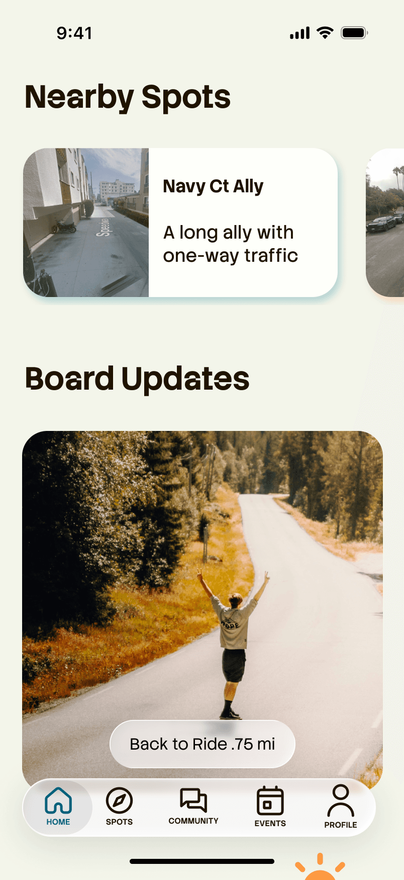
While an active ride is in progress, a persistent session pill floats above the navigation bar displaying the user's live mileage. This allows riders to freely browse other sections of the app without losing track of their session, eliminating the anxiety of navigating away mid-ride and ensuring the experience never interrupts the flow of exploring the community.
The home screen adapts dynamically after a completed session, replacing the motivational weather card with a personalized ride recap. Rather than greeting the user with a generic experience, Carve celebrates the ride they just finished, surfacing their distance, time, and current conditions alongside an nudge to get back out and skate again.
Original 2013 Concept
Lo-Fi Wireframe
The Redesign
The original Longboarding app was built in 2013 as a graphic design exercise, a visual concept with no formal UX foundation behind it. The interface relied on heavy photography, bold ribbon-style navigation, and a dark color palette that prioritized aesthetic over usability. While the passion behind it was real, the experience was fragmented, the navigation required a back button at every turn, and core community features were either underdeveloped or missing entirely.
Returning to this app years later with a UX lens completely reframed how I saw it. What once felt like a complete product revealed itself as a collection of good intentions without the structure to support them. The redesign wasn't about erasing what was there. It was about honoring the original idea and finally giving it the foundation it deserved.
Each screen went through a deliberate evolution. Wireframes stripped away every visual decision and forced the focus back to what mattered. Where does information live, how does a user move through it, and what does each screen actually need to accomplish. Only after those questions were answered did visual design enter the conversation.
The result is a product that still carries the energy of the original, bold, community-driven, and built for people who love to skate, but now backed by intentional information architecture, a cohesive design system, and interactions designed around how real users actually behave.
Lo-Fi Wireframe
The Redesign
Original 2013 Concept
Original 2013 Concept
Lo-Fi Wireframe
The Redesign
While an active ride is in progress, a persistent session pill floats above the navigation bar displaying the user's live mileage. This allows riders to freely browse other sections of the app without losing track of their session, eliminating the anxiety of navigating away mid-ride and ensuring the experience never interrupts the flow of exploring the community.
The home screen adapts dynamically after a completed session, replacing the motivational weather card with a personalized ride recap. Rather than greeting the user with a generic experience, Carve celebrates the ride they just finished, surfacing their distance, time, and current conditions alongside an nudge to get back out and skate again.
Accessibility Considerations
Color Contrast and Legibility
The Carve color palette was evaluated for WCAG compliance throughout the design process. Coffee Bean was selected as the primary text color against the Ivory background to maintain sufficient contrast ratios for users with low vision or color sensitivity. Sandy Brown was intentionally reserved for CTAs and interactive highlights rather than body text to avoid contrast issues at smaller type sizes.
Touch Target Sizing
All interactive elements including navigation bar icons, spot cards, and action buttons were designed with a minimum touch target size of 44x44px in accordance with Apple's Human Interface Guidelines. This ensures the app remains comfortably usable for individuals with motor impairments or larger hands, reducing accidental input and improving overall navigation accuracy.
High-Fidelity Prototype
With the wireframes validated and the visual design system fully established, I brought Carve to life as a high-fidelity interactive prototype in Figma. The prototype captures the primary user flow, Ryder's spot discovery journey through the app, allowing for a realistic representation of Carve's core interactions. Key moments including the persistent session tracking pill, the polaroid-style community posts, and the conditional home screen states are all demonstrated within the prototype experience.
Going Forward
Going Forward
Takeaways
Target Impact
Carve was redesigned with the goal of becoming the definitive app for the longboarding community. A dedicated space where riders can discover new spots, track their sessions, and build genuine connections with other skaters in their area. By consolidating the core pain points of spot discovery, community engagement, and ride tracking into one unified experience, the redesign aims to eliminate the fragmentation longboarders currently navigate across multiple platforms and establish Carve as the home base the community has never had.
What I learned
Redesigning an app I originally built myself was both the most challenging and most rewarding aspect of this project. It required separating personal attachment from professional judgment and grounding every decision in user needs rather than nostalgia. I also learned that constraints are clarifying; committing to a niche audience rather than broadening the scope made every design decision more intentional and gave Carve a sharper, more authentic identity. Most importantly, this project reinforced that good design is never truly finished. Carve taught me to think beyond the screen and consider the full context of how, when, and why someone reaches for their phone.
Future development would prioritize giving users full control over their location data. This includes the ability to make their profile location private, opt out of appearing in active rider counts, and control whether their submitted spots are publicly visible or restricted to followers. Addressing these privacy considerations is essential groundwork before any public launch, ensuring every user feels safe and in control of their personal information.
Next Steps
Privacy Controls and Location Settings
The immediate next step would be conducting moderated usability testing sessions with real members of the longboarding community. Authentic user feedback would validate current design decisions, surface pain points not captured during the concept phase, and directly inform a second design iteration before any development investment is made.
Usability Testing with Real Longboarders
A future version of Carve would explore native integration with Apple Health and Google Fit, allowing users to log longboarding sessions as workout activity and capture metrics including calories burned, heart rate, and active minutes alongside existing ride data. This enhancement would deepen the ride tracking experience and position Carve as both a community platform and a fitness companion for the active longboarder.
Ride Tracking and Health App Integration
Target Impact
Carve was redesigned with the goal of becoming the definitive app for the longboarding community. A dedicated space where riders can discover new spots, track their sessions, and build genuine connections with other skaters in their area. By consolidating the core pain points of spot discovery, community engagement, and ride tracking into one unified experience, the redesign aims to eliminate the fragmentation longboarders currently navigate across multiple platforms and establish Carve as the home base the community has never had.
What I learned
Redesigning an app I originally built myself was both the most challenging and most rewarding aspect of this project. It required separating personal attachment from professional judgment and grounding every decision in user needs rather than nostalgia. I also learned that constraints are clarifying; committing to a niche audience rather than broadening the scope made every design decision more intentional and gave Carve a sharper, more authentic identity. Most importantly, this project reinforced that good design is never truly finished. Carve taught me to think beyond the screen and consider the full context of how, when, and why someone reaches for their phone.
Privacy Controls and Location Settings
Future development would prioritize giving users full control over their location data. This includes the ability to make their profile location private, opt out of appearing in active rider counts, and control whether their submitted spots are publicly visible or restricted to followers. Addressing these privacy considerations is essential groundwork before any public launch, ensuring every user feels safe and in control of their personal information.
Usability Testing with Real Longboarders
The immediate next step would be conducting moderated usability testing sessions with real members of the longboarding community. Authentic user feedback would validate current design decisions, surface pain points not captured during the concept phase, and directly inform a second design iteration before any development investment is made.
Ride Tracking and Health App Integration
A future version of Carve would explore native integration with Apple Health and Google Fit, allowing users to log longboarding sessions as workout activity and capture metrics including calories burned, heart rate, and active minutes alongside existing ride data. This enhancement would deepen the ride tracking experience and position Carve as both a community platform and a fitness companion for the active longboarder.